Flex Utility Premium
- 4.7
- Rating
- 10.00K
- Installs
- $21.99
- Price

 Analysis by App-foxy
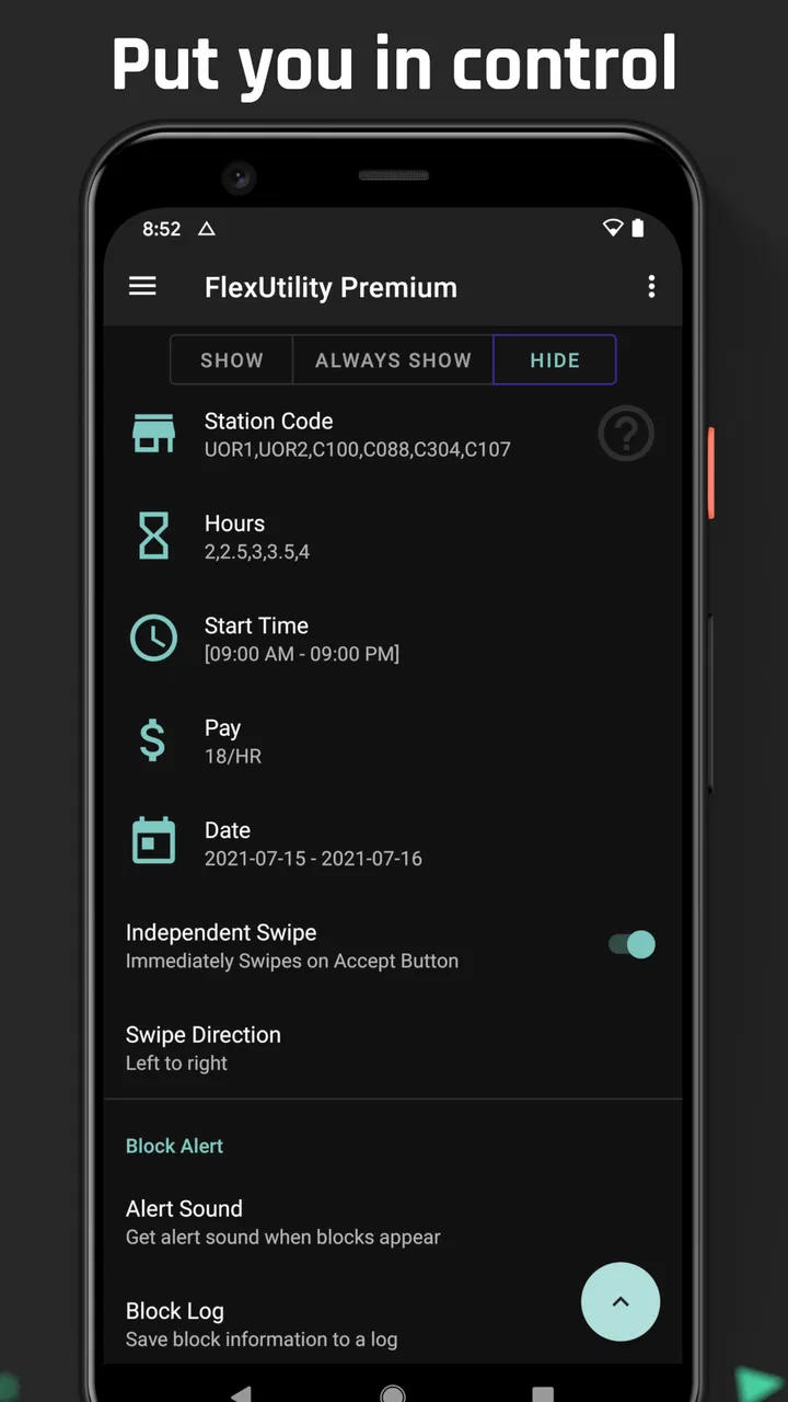
I approached Flex Utility Premium as a practical Android tool rather than something to open for entertainment. Its purpose is to make certain tapping tasks more convenient and to provide block filters, which gives it a fairly specialized place among utility apps. That focus matters: this is not the sort of download I would recommend simply because everyone needs another tool on their phone. I would consider it when a repeated tapping workflow is slowing me down or when I need more control over what gets blocked during that workflow.
The app is developed by JW Dev and sits in the Tools category. It has earned a 4.7 average from around 3.5 thousand ratings, with more than 10 thousand installs. Those figures suggest that it has found a clear audience, but they also underline its niche nature. I would not judge it like a general-purpose productivity suite. Its value depends almost entirely on whether its particular approach to tapping and filtering matches the task I want to complete.
From a repetitive task to a cleaner outcome
I’d use a shared phone or tablet as a reason to agree on the task before anyone configures tapping or filters: one person can explain what should happen, while the other checks the result. That makes the next section’s focus on setup boundaries especially practical, because a useful configuration should stay tied to its intended screen and purpose.
You May Also Like

 AccuWeather: Weather Radar
AccuWeather Review: A Quick, Clear Forecast for Everyday Decisions
For everyday plans, the best forecast is the one you can understand quickly. AccuWeather makes rain timing, radar, and local conditions easy to act on, with a few trade-offs.

 Hill Climb Racing
Why Hill Climb Racing Still Turns Crashes Into One More Run
A tiny car, a bumpy hill and one more upgrade: Hill Climb Racing keeps resurfacing because its simple chaos makes every near-miss feel personal.

 AliExpress - Shopping App
AliExpress Makes Global Shopping Feel Personal, but Shoppers Bear the Risk
AliExpress turns a global marketplace into a pocket-sized discovery engine. Its reach is useful, its shopping loop compelling, and its trade-offs easy to miss.

 Lords Mobile: Kingdom Wars
Lords Mobile Is a Kingdom-Building Routine, Not a Quick Match
A case-by-case verdict on the building, battles, device demands, and social commitments that make Lords Mobile rewarding for some players and exhausting for others.

 PDF Scanner app - TapScanner
TapScanner Makes Paperwork Easier to Capture, Check, and Share
TapScanner makes scanning with a phone feel less like a rescue operation and more like a dependable step in getting work done. Its capture tools are useful, though not flawless.

 Block Blast!
 Shows How Much a Puzzle Game Can Leave Out
A quiet grid game shows why puzzle players increasingly value instant clarity, repeatable skill and low-pressure play—and where the genre still needs to catch up.
More From Our News Desk
View All News


Starting with the right problem
The best starting condition for this app is a task that is simple but repetitive. Imagine working through a screen where the same kind of tap is required again and again, while unwanted items or interruptions make the process harder to follow. In that situation, a utility built around convenient tapping and block filters can be more useful than a collection of unrelated automation tools. I would first identify exactly what I want to make easier: the tapping itself, the visual clutter around it, or both.
That distinction is important because the app is not a universal replacement for every automation solution. If I need a broad workflow engine that connects many unrelated services, I would look elsewhere. If the problem is concentrated around screen interaction and filtering, however, the focused design makes more sense. The app is at its strongest when I already understand the manual process and want to reduce the annoying parts rather than hand over an entire complicated routine.
I also appreciate that the content rating is Everyone. That makes the app easier to consider for a wide range of users, although an age label does not automatically make a specialized tool suitable for every person. Someone unfamiliar with utility settings may still need time to understand what each option changes. I would approach the first setup carefully instead of immediately applying an aggressive configuration to an important task.
Building the workflow one stage at a time
My preferred way to use a tool like this is to begin with the smallest possible job. I would open the relevant tapping utility, examine the available controls, and create a narrow setup aimed at one screen or one repeated action. Starting small makes it easier to tell whether the app is actually helping. It also avoids the common mistake of changing several filters at once and then being unable to identify which setting caused an unexpected result.
The tapping side of the workflow is most useful when convenience matters more than complexity. A repeated action can be tiring or distracting when performed manually, especially if the surrounding screen contains elements I do not want to interact with. The practical benefit is not that every task becomes automatic; it is that the mechanical part becomes less demanding. I would still keep an eye on the result, particularly during the first few attempts, because a convenient tap is only helpful when it lands on the intended target.
The filtering stage deserves equal attention. Block filters can make a working area easier to manage, but filtering is always a trade-off between removing noise and hiding something that turns out to matter. I would add one filter, test the screen, and then decide whether another is justified. This is a more reliable workflow than trying to block everything at once. It also creates a useful fallback: if the outcome changes unexpectedly, I know which recent adjustment to reverse.
One non-obvious advantage of this gradual approach is that it separates convenience from confidence. I can first check whether the tapping behavior is predictable, then evaluate whether the filters leave the right content visible. That separation is especially helpful for a tool with two related but distinct jobs. When both are tuned together immediately, it becomes difficult to tell whether a problem comes from the tap action or from the filtering rules.
A realistic everyday handoff
Consider a person handling a routine on an Android phone while moving between several screens. The starting condition is a sequence of repeated taps, interrupted by elements that are not relevant to the task. Instead of repeatedly correcting the same manual action, the user prepares a focused tapping setup and applies a filter intended to reduce those distractions. The first handoff is from the person’s understanding of the task to the app’s configured behavior.
That handoff should not be treated as a complete transfer of responsibility. I would remain nearby for the first run, watching whether the tap lands where expected and whether the filter removes only what I intended. Once the result is stable, the app can take care of the repetitive portion while I handle the parts that require judgement. This division is more realistic than expecting a utility to understand the purpose of every item on a screen.
The second handoff is from the app back to me. After the tapping and filtering have done their work, I still need to inspect the outcome. Did the intended screen advance? Did the useful information remain visible? Did the filter simplify the process or merely conceal a warning or control? These checks take little time, but they protect against the main weakness of screen-based convenience tools: they can perform an action accurately while still acting on the wrong context.
For repeated work, I would keep a simple mental record of which setup belongs to which task. Even without turning the app into a large automation system, naming the purpose of each configuration in my own notes can prevent accidental reuse. A setup that works well on one screen may be unsuitable on another. This is one of the clearest trade-offs compared with a basic manual method: the app can save effort, but it asks me to be more deliberate about preparation.
Where it compares well with ordinary alternatives
The usual alternative is to tap manually and tolerate the distractions. That approach costs nothing extra and requires no learning, so it remains the better choice for a one-off action. Manual tapping is also easier when the screen changes constantly or when every decision depends on information that cannot be predicted. I would not install a specialized utility merely to avoid a handful of taps.
At the other end are broader automation apps. They may be preferable when a workflow involves several apps, conditional steps, schedules, or data transfers. Their flexibility can justify the additional setup, but it can also make a simple tapping problem feel unnecessarily complicated. Flex Utility Premium is more appealing when I want a focused tool rather than a general automation platform. Its narrower purpose can reduce the distance between identifying the annoyance and testing a solution.
There is also a difference between this kind of utility and a screen-recording or macro approach. A recorded sequence may be convenient when the screen remains identical, but it can become fragile when layouts shift or an unexpected element appears. A workflow centered on deliberate tapping and block filters may be easier to adjust in small pieces. I would still test it after any major change to the screen, because no screen interaction method should be assumed to understand a redesigned interface automatically.
The premium positioning is another factor. The listed price is $21.99, and in-app purchases range from $5.99 to $49.99 per item. That makes the buying decision more serious than downloading a casual free utility. I would only pay if the repeated task is frequent enough, frustrating enough, or valuable enough that the saved effort clearly outweighs the cost. For occasional use, manual interaction or a less specialized alternative may be financially wiser.
What the result looks like in practice
A successful result is not simply “the app tapped for me.” The better outcome is a workflow in which I spend less attention on mechanical repetition and more attention on the information or decision that actually matters. The filter should make the working screen easier to read, while the tapping assistance should reduce unnecessary physical effort. When those two parts cooperate, the app earns its place as a focused tool rather than another icon on the home screen.
I would judge success using three practical questions. Did the setup reduce the number of manual corrections? Did the filter preserve the controls and information I needed? Could I repeat the process later without rebuilding everything from memory? These questions are more useful than simply asking whether the feature worked once. A tool can demonstrate a clever action and still be inconvenient if preparing it takes longer than doing the task manually.
The current version is 237, and the app supports Android 7.0 and later. That broad operating-system requirement makes it relevant to users who are not carrying a recent phone, although compatibility alone does not guarantee that every device will feel identical. Screen size, system behavior, and the way an individual app presents its interface can all affect a tapping workflow. I would test the exact task on my own phone before relying on it for something time-sensitive.
Another useful insight is that filtering can improve attention even when it does not save many taps. If the screen is crowded, removing irrelevant elements may lower the chance of choosing the wrong control. In that case, the app’s value comes from reducing visual friction rather than maximizing speed. I would use that benefit cautiously, because a cleaner screen is only better when the filter remains transparent enough for me to understand what has been excluded.
Where the flow breaks
The workflow breaks first when the user expects the app to make decisions that were never clearly defined. A tapping utility can help with a known interaction, but it should not be treated as a substitute for supervision. If the target moves, the screen changes, or a new prompt appears, the same action may no longer be appropriate. This is why I would avoid leaving an unfamiliar setup unattended until I had watched it behave consistently.
The second weak point is over-filtering. A block filter can remove clutter, but it can also remove context. If I cannot immediately explain what a filter is hiding and why, I would disable it and rebuild the configuration more carefully. The safest workflow is reversible: make one change, check the result, and keep the previous arrangement available until the new one proves itself.
There is also a learning curve that the short store description does not convey. The app’s focus is clear, but focused tools often reward users who are willing to understand their controls. Someone looking for a single button that solves every repetitive task may find the setup less comfortable than expected. I would recommend it to a patient user who has a defined problem, not to someone hoping for effortless automation without testing.
Cost can break the flow as well. The upfront price and optional purchases mean I would not treat this as an impulse download. Before paying, I would identify the exact recurring task, estimate how often I face it, and compare that burden with the time needed to learn and maintain the app. If the task happens rarely, the premium model is difficult to justify. If it appears throughout my routine, the calculation becomes more favorable.
Who should use it and who should skip it
I see Flex Utility Premium as a good fit for Android users with a narrow, recurring tapping problem and a clear reason to control distracting screen elements. It may also suit someone who prefers a dedicated utility over a large automation suite, especially when the desired workflow stays close to one device and one type of interaction. The app’s strong average rating and established install base provide some reassurance that the concept resonates with other users, but the specialized nature still matters more than popularity.
I would skip it if I only need occasional taps, if my work depends on rapidly changing screens, or if I need advanced cross-app automation rather than focused interaction assistance. I would also choose another option when the task involves sensitive decisions that should never be triggered by a repeatable screen action. In those cases, manual control or a more transparent workflow is safer and easier to audit.
My final recommendation is conditional but positive. This is not a universal Android essential; it is a targeted tool that can turn a frustrating repeated process into a more manageable one. I would begin with a small test, add filters conservatively, watch the first handoff from setup to action, and inspect the result before trusting the workflow. If that process solves a problem I face regularly, the premium cost may be worthwhile. If not, the usual manual method will probably remain the simpler choice.
FAQs for Flex Utility Premium
01What is Flex Utility Premium, and what can I use it for?
Flex Utility Premium is designed as a collection of practical tools intended to make everyday tasks more convenient on a mobile device. Depending on the version and platform, its features may include utilities for organization, device management, customization, or productivity. Before downloading, review the current store description carefully, because the available tools can vary between Android and iOS and may change through future updates.
02Is Flex Utility Premium free to download, or does it require payment?
The word “Premium” usually indicates that Flex Utility includes paid access, premium features, or an optional subscription, although the exact pricing model may differ by platform and region. Check the Google Play or App Store listing before installing to see whether there is an upfront cost, in-app purchases, advertising, or a free trial. Also verify renewal terms if a subscription is offered.
03Is Flex Utility Premium safe to install and use?
You should download Flex Utility Premium only from its official Google Play Store or Apple App Store listing. Before installation, check the developer name, recent user reviews, update history, privacy details, and requested permissions. A utility app may need access to certain device functions, but permissions should be relevant to its features. Avoid unofficial APK files or modified versions, since they may contain security risks.
04What devices and operating systems are compatible with Flex Utility Premium?
Compatibility depends on the specific release of Flex Utility Premium and whether you are using Android or iOS. Open the official store page on your device to confirm the required operating-system version, supported hardware, download size, and regional availability. Older phones or tablets may not support every feature, while some functions can work differently because Android and iOS provide different system permissions.
05Does Flex Utility Premium collect personal information or require special permissions?
Before using Flex Utility Premium, read its privacy policy and the data-safety information shown in the relevant app store. Pay attention to whether the app collects identifiers, usage information, location data, contacts, or diagnostic details, and whether data is shared with third parties. Only grant permissions necessary for the features you intend to use, and revoke access later through your device settings if needed.
Pros
- Combines several practical tools in one lightweight utility app.
- Premium version generally offers a cleaner
- ad-free experience.
- Simple interface makes common functions easy to find.
- Useful for users who prefer customizable utility settings.
- Can reduce the need to install multiple single-purpose apps.
Cons
- Some features may depend on the device model or Android version.
- Premium access may feel expensive for occasional users.
- Advanced tools can require extra permissions to work properly.
- The interface may seem basic compared with more specialized apps.
- Updates and feature availability can vary by platform.

Flex Utility Premium
Gallery